
What Changed Recently in QR Code Design and What Should I Do Now
What changed recently in QR code design and what should I do now? Focus on scan reliability, brand fit, and mobile landing pages.
On this page
What Changed Recently in QR Code Design and What Should I Do Now
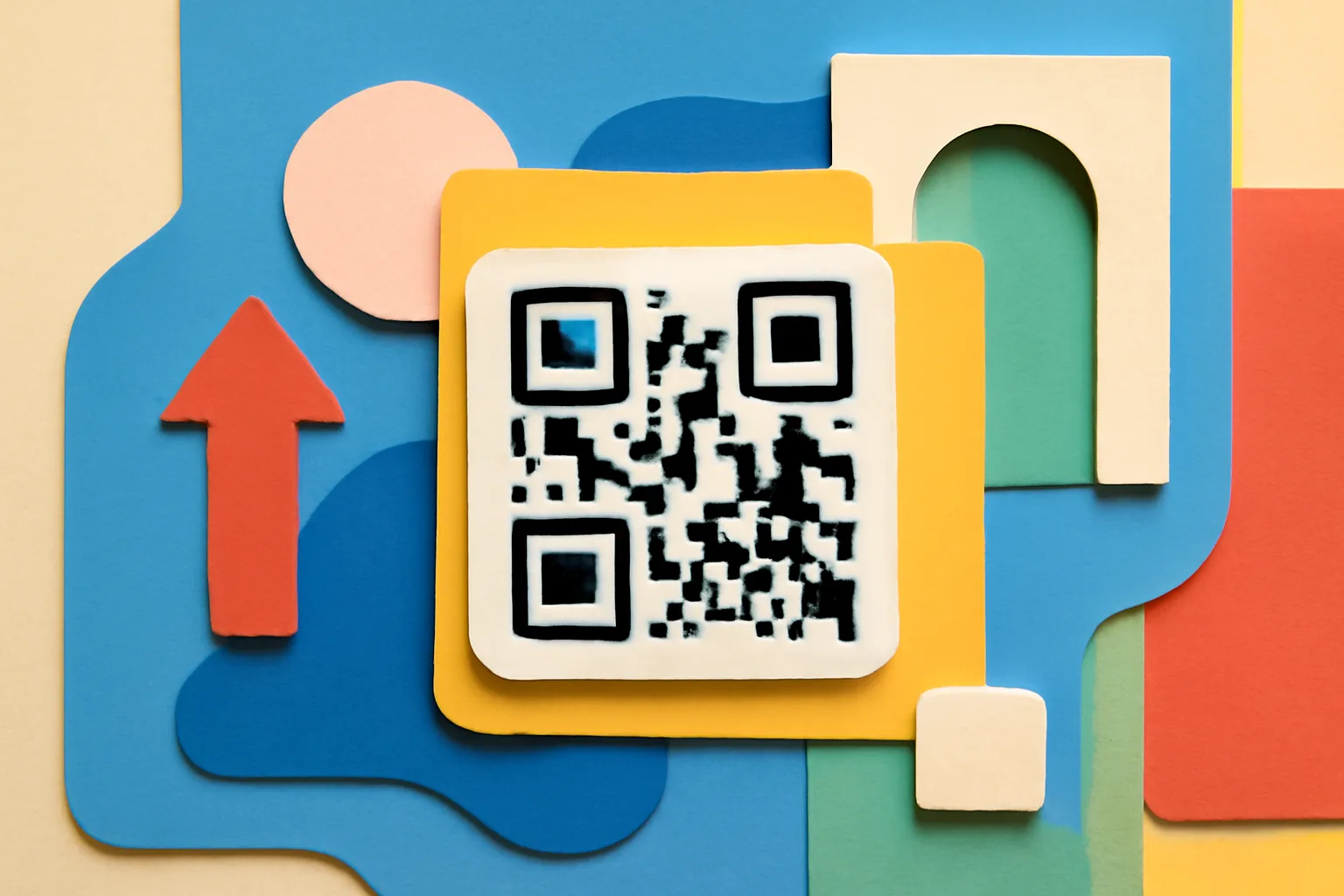
QR code design has changed in one quiet but practical way: teams now treat the QR code as part of a brand system, not a black-and-white square that only exists to survive a print run. That shift sounds small. It is not. A QR code on a menu, package, poster, or handout now has to look right, scan fast, and still lead somewhere useful after the scan.
So if you are asking yourself what changed recently in QR code design and what should I do now, start by separating the visible design from the scan setup. A prettier code can still fail if the print is too small, the contrast is weak, or the code sits in a crowded corner near another graphic. I have seen a polished QR code fail on a glossy box because the lighting on the shelf was doing all the wrong things at once.
1. Separate design changes from deployment changes
The first mistake is fixing the wrong layer. Design changes are the things people can see: rounded dots, logo placement, color choices, quiet zone treatment, and edge framing. Deployment changes are the things that make the QR code work: print size, placement, distance from the viewer, and whether the code sits on matte paper, coated stock, a screen, or a curved package.
That distinction matters because a QR code can look modern and still be a bad QR code. If the issue is scan distance, no amount of visual polish helps. If the issue is that the code was resized inside a layout until it became tiny, the brand treatment is not the real problem. Fixing the wrong layer wastes time and often creates a second problem while the first one stays put.
One useful habit is to ask a simple question before changing anything: is this a design issue or a deployment issue? If the code scans in the office but not on the shelf, that points to placement, print, or lighting. If the code works everywhere yet looks off-brand, then the visual treatment deserves a review.
2. Check whether your codes still scan reliably in real use
Real use is messier than a design file. A code that scans at your desk may fail in a store aisle with glare, or on a wall sign viewed from 8 feet away, or on a handout held in a moving hand. Test the QR code in the exact conditions your audience faces, not just in ideal light.
Run quick checks across four things: lighting, distance, screen brightness, and print size. A code on a phone screen may need a higher brightness setting than you expected. A code on packaging may need more white space around it than the mockup showed. A code on a menu may need to stay readable after a laminate finish adds reflection. None of this is glamorous. It is the work.
Do a floor test. Do a wall test. Do a table test. If the QR code is used on handouts, hand one to someone standing two steps away and watch where they hold the page before scanning. That tiny motion tells you more than a design review in a conference room.
3. Review your visual treatment for brand fit
Brand styling for a QR code is now normal, but normal does not mean safe. A code can carry a logo, a brand color, or a shaped module pattern and still scan well, but only if the contrast stays strong and the edges remain clear. This is where teams sometimes push too far. A QR code with low contrast or weak corners may look elegant in a mockup and fail in the hand.
Check the quiet zone first. Then check the edges. Then check the color pair. If the background has texture, pattern, or a photo behind the QR code, the code has to fight for visibility. A small logo in the center may be fine. A large logo that interrupts the structure may not be.
Brand fit should support the QR code, not compete with it. If your brand system uses a bright accent color, that color may work on the finder frame or caption, while the actual QR modules stay dark and clean. That split is often the smarter choice. One of my favorite fixes is boring: keep the code simple, and let the caption do the brand work.
If you are already using dynamic QR codes, this is also a good time to confirm whether the visual version and the destination version still match the same campaign. A stylish QR code paired with a stale landing page creates a mismatch people notice within seconds.
4. Test the code in the devices and apps your audience actually uses
Do not assume one phone proves anything. Test on iOS, Android, built-in camera apps, and at least one lower-end device. A QR code that scans instantly on a newer phone may take longer on a cheaper handset with a weaker camera or slower processing. That difference matters when people are standing in line or carrying bags.
Try more than one app path too. Some users scan through the native camera. Others use messaging apps or social apps that open their own camera interface. The QR code should behave predictably across those paths. If your audience includes older customers, field workers, event staff, or visitors in bright outdoor settings, test those conditions as well. One device type is never enough.
Check the code with your team’s oldest phone. Check it again with the brightest one. Short test, real device, real light. If you are not seeing a scan within a few seconds, your audience probably will not either.
5. Inspect the destination experience after the scan
The scan is only half the job. After the QR code opens, the landing page has to load fast enough, read well on mobile, and reflect the promise implied by the code placement. If the code sits on a product label, the page should support the product. If it sits on a poster for an event, the page should confirm the event in the first screen. If it sits on a receipt, the page should feel like a next step, not a detour.
Slow pages make the QR code feel broken even when the code is fine. A desktop-first page squeezed onto a phone screen does the same thing. So does a landing page that asks for too much before showing the thing people came for. One extra tap is not always fatal. Three extra taps often are.
Make the landing page answer the scan quickly. That number may change by channel, but the rule stays the same: the user should not wonder whether the QR code sent them to the right place. If the answer is buried, the QR code has failed its most basic job.
If your QR code sends people into a link you can edit later, review the redirect path too. A quick look at 301 vs 302 redirects can help you decide whether the current setup still fits your campaign timeline and your tracking needs.
6. Decide which existing codes should stay plain and which can be redesigned
Not every QR code needs a redesign. Some should stay plain because they already scan well, already match the package or poster, and already send people to a good page. Leave those alone. Stability has value, especially for high-use codes on packaging, menus, invoices, or in-store signage.
Redesign only when the QR code has a visible problem or a real business reason. High-visibility codes on a launch display may deserve a better brand treatment. A code on a premium box may also need a cleaner look. But if the scan works and the current style is not hurting the experience, a redesign can introduce risk without adding value.
Think in categories. Keep the functional codes. Review the public-facing codes. Redesign the codes that sit at the center of a campaign and are seen by large numbers of people every day. A QR code on a back-office document does not need the same design attention as one on the front of a retail shelf.
If the current code is already tied to a tracked destination, it may also be worth pairing this review with retargeting pixels on short links so the scan path and measurement plan stay aligned after the visual update.
7. Set a small design update workflow for new QR assets
New QR code assets need a short approval step. Keep it simple: contrast, size, error correction, and test scans. Four checks. That is enough to stop most avoidable mistakes before a file reaches print or gets exported into a presentation, sticker sheet, or poster layout.
Use one person to confirm the visible design, and another person to test the scan. The same designer can do both, but a second pair of eyes catches tiny issues faster. A logo placed too close to the center. A code shrunk below the safe size. A caption that looks fine on screen but disappears on the final print. These are ordinary misses, not rare ones.
Write the approval step down in one page. Not a giant process document. A one-page checklist with the four checks, the device tests, and the destination review is enough for most teams. If the QR code is part of a recurring campaign, save the checklist with the template so the next launch does not start from scratch.
Teams that already manage linked destinations may want a shared reference point at urlik.xyz so the same people who approve the QR code also know where the campaign assets and link tools live.
8. Schedule a lightweight retest after every print or layout change
Every print change can alter the QR code. A new paper stock, a different coating, a smaller layout, a revised fold, or a shifted margin can all change scan behavior. That means the last test from the last version is not enough. Retest after each print or layout change, even if the design looks identical on screen.
Build a 3-step final check: scan the code, inspect the placement, and compare the destination. Scan it with the phone you expect your audience to use. Inspect the final printed piece, not just the proof. Compare the landing page with the promise on the page where the QR code appears. Three steps. Every time.
One missed retest can send a large batch of materials into the world with a broken QR code. That creates reprints, support questions, and wasted time that could have been avoided with a 60-second check. The cost is not only the print. The cost is the first impression.
If your team also changes the underlying destination often, A/B testing links can help you decide whether a QR code update is improving scans or simply changing the path without a clear gain.
Keep the last test close to production. Then repeat it after the print run. Then repeat it again if the layout changes, even by a little. A QR code does not care that the design file looked perfect on Tuesday.
Put this into practice
Paste a link and get a short URL, a QR code and click stats in seconds — free, no sign-up.
More from the blog
What changed in QR code scanning on iPhone and Android recently
What changed in QR code scanning on iPhone and Android recently: phones now scan in the camera app, with different prompts, previews, and app handoffs.
Custom Short Link Domain for a Brand
Learn how a custom short link domain for a brand improves trust, recognition, and cleaner sharing across marketing channels.
Dynamic QR Codes: Change the Destination After Printing
A dynamic QR code wraps a short link, so you can repoint printed codes any time and count every scan. How they beat static codes, and how to print them right.